Calgary Queer Arts Society's OUTREELS Rebrand
Calgary Queer Arts Society’s OUTREELS Rebrand
I have had the pleasure of working (and volunteering) with the Calgary Queer Arts Society (formerly Fairy Tales Presentation Society) in various capacities since 2014, primarily working on the technical side of the Fairy Tales Queer Film Festival. In 2020 I had the opportunity to take part in the rebranding of their year-round allyship education and training program, OUTREELS. The non-profit organization had recently rebranded and changed the name and wished to follow suit in updating this education series with a refreshed and more relevant look that was consistent with the rest of their branding so I was brought on to redesign and animate a new logo for the program.

Original OUTREELS Logo
OUTREELS began as an educational film screening program, with presentations about the LGBTQ+ community in schools, businesses and community organizations which were paired with relevant films to demonstrate and represent the ideas and identities taught. The name and original logo icon of an abstracted film reel were heavily influenced by the significant role that film played in the program.
Early in the rebranding process, it was decided that the name “OUTREELS” was already well-established and held significant meaning for Calgarians who were familiar with it so, although there had been a shift away from film screenings at every session, it was decided that the name would be unchanged. However, there was a conscious decision to change the program’s sub-title to be more reflective and descriptive of what the program has become. The ultimate goal of the OUTREELS program is to provide education and training to employees, students, healthcare workers and community members who wish to be good and active allies to the LGBTQ2S+ commmunity, regardless of their own gender or sexual identity. Teaching allyship is the primary focus of OUTREELS so the decision was made to include it in the logo’s sub-title.
Throughout the logo design process, the Calgary Queer Arts Society’s other logos were frequently considered to ensure that the new OUTREELS logo would fit in with the other logos.
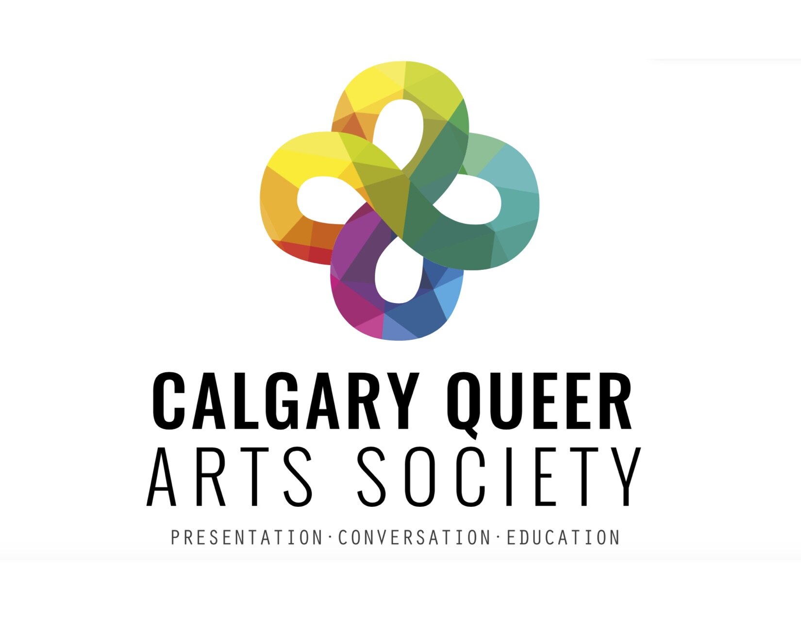
Calgary Queer Arts Society Logo - Designed by Alchemy Communications

Fairy Tales Queer Film Festival Logo - Designed by Alchemy Communications
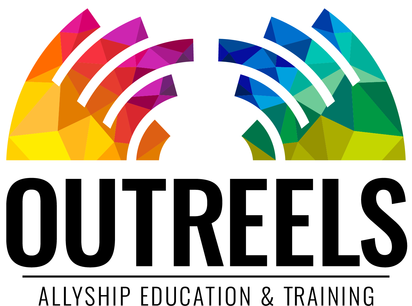
New OUTREELS Logo - Designed by Veronica Reeves
There was a desire to maintain consistency in the typography and the rainbow fractal concept. I also wanted to maintain a sense of symmetry as is present in the previous two logos. The concept of a bridge was frequently considered as the Calgary Queer Arts Society describes the OUTREELS program as “a bridge to connect the queer community to our neighbours through education”. In our many discussions about what allyship meant to the organization, there was heavy emphasis on allyship being two-sided, that members of the LGBTQ2S+ community should not be soley responsible for educating and holding the hands of allies. I wanted to represent both sides putting in effort. In this instance I wished to represent the OUTREELS educators offering personal lived experiences and training while allies make an active effort to learn and seek out information to expand their knowledge and understanding and thus there is an active effort from both sides to “bridge” the knowledge gap.
In addition to the logo design, I also animated the logo to be used in promotional and educational video content for the OUTREELS program.
OUTREELS Logo Animated by Veronica Reeves